Disclaimer: This is not a job I’ve done with a company or as freelance, this is just a case study.
This is a take I’ve made on a landing page for one of the website I’ve been using a lot during my job hunt in autumn 2020.
I had access at some point to guidelines of the website. I try to apply one of the principle I’ve apply while working at Adylic, which was to play with the guidelines, to respect them, but adding a bit of liberty to it. Overall, I followed what I had and also get inspiration from what I could find from them, such as home page, or other landing pages I could find.
Because it’s a case study, I didn’t want to take as much time as I wanted to design it, I’ve set myself a time limit of 2 days to design a landing page for desktop and mobile using Adobe Xd. As the time I was using it, I was not as comfortable as I am now, but this project helped me to improve my knowledge of that software.
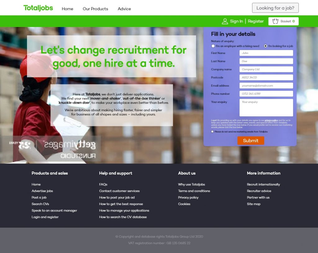
I tried to keep the header and top menu as similar as the design of TotaJobs at the time of designing it. Als, with some marketing newsletters received, it was in the same spirit. It makes sense to me as want a new user of that website to be comfortable where he/she is. If he/she decides to continue to use the website, the feeling of landing on a different design might fright him/her.
The use of those white opaque blocks is to have a reminder of the icon of TotalJobs, called the totem in their own terms.
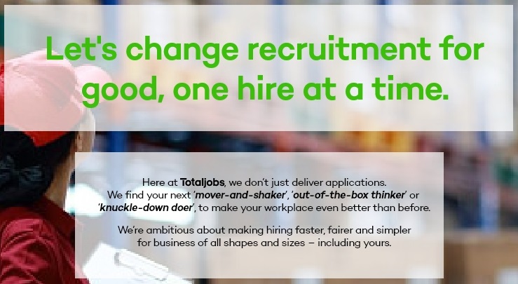
I think using it to display the main copy of the page. I’ve use the TotalSans font with the TotalJob bright green to catch the eye of the user and inviting him/her to read the text.
After a look back at it, I think I could have increased the opacity of the white background so the copy is more popping and a bit more legible.
I’ve also included the logo of the brand in the paragraph of the text so the identity of the brand is preserved in any case and a new visitor on this page will be able to remember it more quickly.
Some key words have also been put in bold to call the eyes and invite again to read this bit of copy.
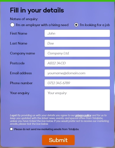
The content of the main form has been – as well as the previous copy – inspired from similar landing pages from newsletter I’ve received.
I’ve pre-filled up the fields so the user can see what’s requested in a blink of an eye. The grey tone used for the copy indicates him/her that it is not filled up.
This grey has been picked from the grey palette of the guidelines, as well as the CTA. The background is a purple picked from the secondary colour palette. It has a slight opacity so the background picture is not fully hidden.

Also, for the background picture, I went on gettyimages to use a Comp licence picture, I really liked the following one, I thought it brings a nice illustration to it and it seems to follow the pictures policy of the guidelines.
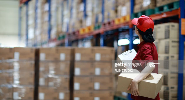
The picture has been slightly extended with some montage I’ve made with Photoshop, so it’s a bit larger. It was a bit difficult and there is a bit of mess visible with a close look. But it’s not visible at the end, the eye is not driven to this point.
Also, at the end I’ve flipped it so the form is not covering the face, as it’s the main focus of the picture. Therefore, the character is face the left, looking for a better future with a new career, found on TotalJobs.
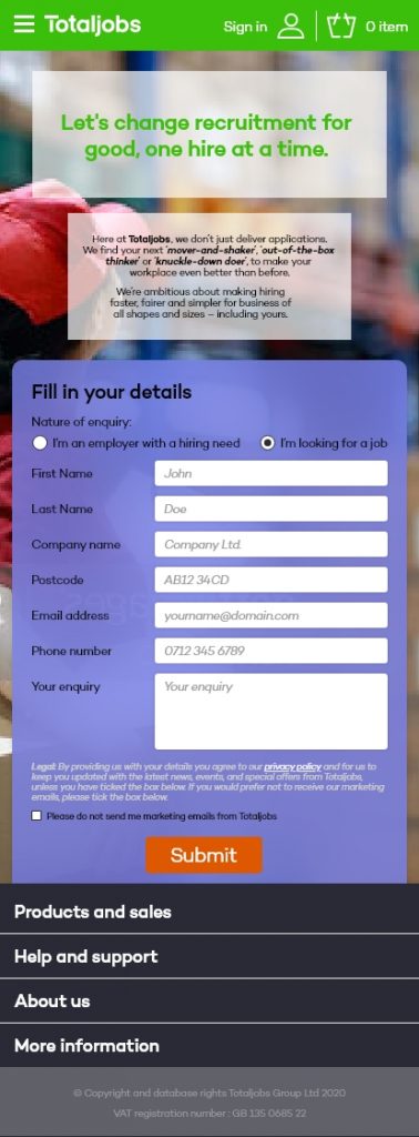
Finally, here stands the mobile version. I’ve run some test with my phone to be sure the copy is legible and everything is looking fine.
Nevertheless, I think it would be more efficient starting with the form directly under the menu. It would pop directly to the user’s screen and it would have been more engaging.
Also, on a development and scaling point of view, it would have make more sense.
On a similar note the totem could have be layout differently so the copy is more big and more inviting. Yes, at the current state it is legible, but it is not at its best.
Overall, I quite like the design, considering the time frame I had. Nevertheless, I think there are still things to improve of different level of the design.
The user experience would be better with some stars or similar signs to indicate which information are mandatory or not in the form. Not everyone want to give an address or telephone number.
Also, I could have limited the extension of the footer menu and maybe remove the basket options. It’s certainly call the vibes of the original website, but it increases the risk of the user not to engage on the form.