
Disclaimer: This is not a job I’ve done with a company or as freelance, this is just a case study.
For this case study, I expose here the work I’ve made inspired by the solution proposed by Relate Data. This company deliver different solutions for network monitoring, cybersecurity or data analysis.
The website exposed diverse screenshots from previous versions, which have been updated on the actual software.
Across all the different screenshots availables, I’ve picked the Network Performance page. This is the first one on the Network Monitoring page and it’s might be not the most obvious.
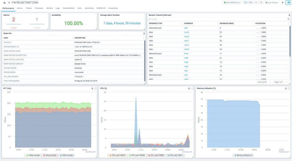
I found it not that easy to use as some information are not really popping directly to the user, which I found problematic. The space management is not optimum and the colour can be improved so it is more easy to attract the user on important information.
The table are not that easy to read with a lot of things going on. Also the graphs can be quite messy with the coloured area. They seem to add more confusion that highlighting what’s necessary.
Following those observations, I’ve design a new page using Adobe XD.
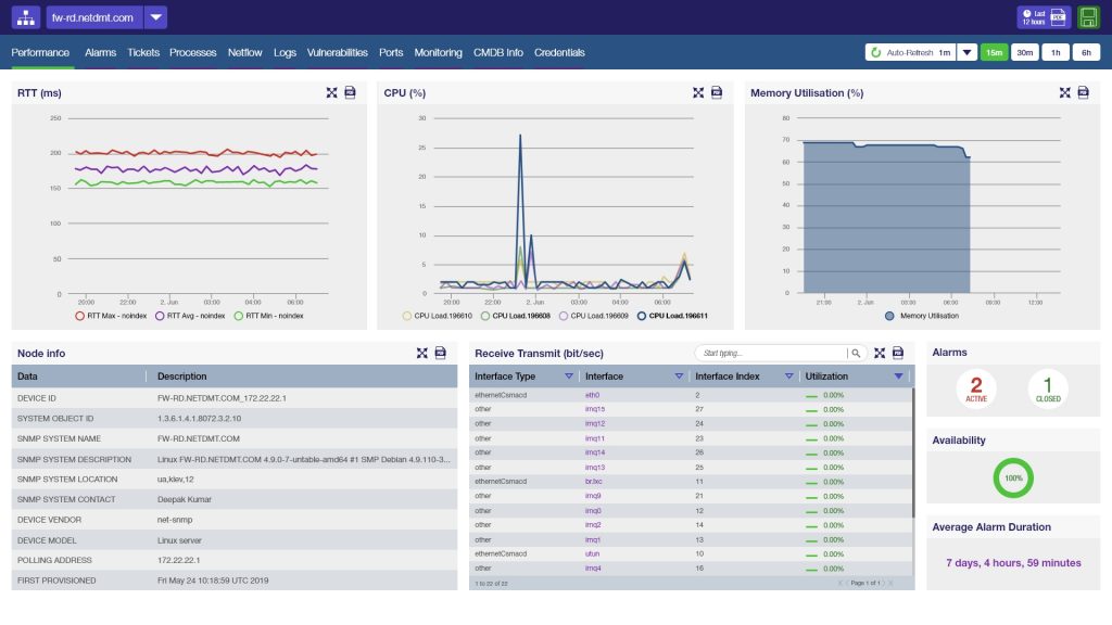
I tried to keep in mind that this tool is for monitoring, so if there is anything wrong, it should be visible quickly. I’ve set the information differently on that matter. I’ve used colours form the Relate Data website and I’ve insert them in Adobe Color tool to have a matching and cohesive colour scheme. It helped to have better contrast to enhance the important information visibility.

I’ve reorganised slightly differently how the refreshing is displayed so it does not get mixed with the export and save options.
Also I wanted to have a different look and feel for the menu, allowing a better understanding of the whole structure of the tools and a better accessibility. I was not sure at first but I’ve find out that the initial buttons on the top left are here to access other domains. To give more clarity, I’ve gave more clear limits to the buttons, trying to keep everything as simple as possible.
All the information are still visible on the screen page with out any scroll required. It makes more sense to me to have the 3 graphic charts visible at first in the page so, as the eye is naturally driven to that part of the screen, the user will be able to capture directly if there is something wrong on CPUs, Memory or Round-Trip Time.
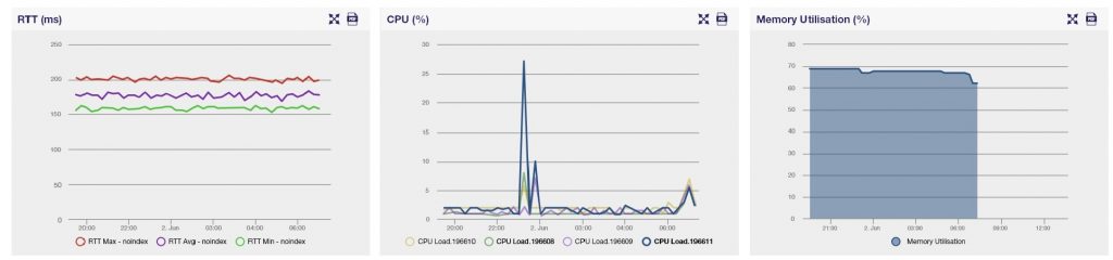
- I removed the area of the RTT graph as it does not serve purpose and diminishes the clarity of the curves.
- I tried to improve the CPUs graph visibility. All those 4 curves were difficult to read and it’s hard to see what happen what CPU. So I removed the area under the curves and played with opacity.
The blue curve is show in bold in the description and full opacity on the graph because it is displayed as selected. Which mean if the user clicks on the green one, it will be bold and full opacity and the blue will be written in Helvetica Neue Lt Std 55 Roman and the curve will be at 50% opacity. - I found that the Memory graph was working fine, so I’ve decided to leave it the same.
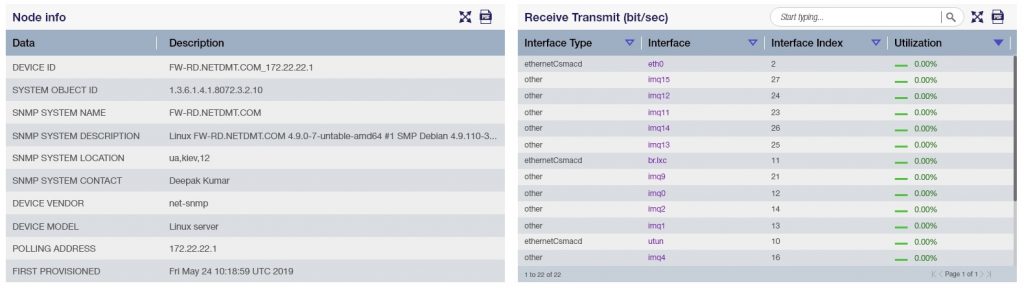
For the tables, I used an alternation of contrast so it is more easy to read. Also, I defined a different width for the columns so there is a better space management and it is more easy to consult. I kept the idea for the Receive Transmit table as, the information are more dense here. Also there’re evolving and need more monitoring than the node info.
I relocated the search option on the top of the block so there is more room for the content. This feature is still important, and located over there, it is less lost in the other lines of informations.
I added the possibility to change the organisation of the table with arrows that would sort the info alphabetically ascending or descending. I think it can be interesting to have this option, to be able to look what have the most of Utilization. I’ve also included a coloured code for this, where green is 0% and OK and red is 100%, so the user can quickly see if there is something to look at.
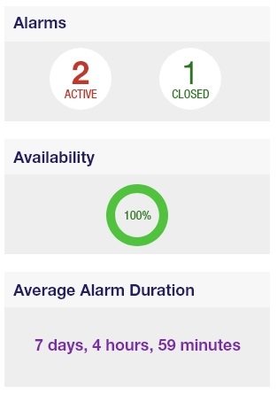
This scheme was also implemented for the alarms and the availability on the last 3 blocks of the bottom left.
The Availability diagram will turn into red if it starts to decrease and also the circle would not be full.
Overall, I’m quite happy with the design. I’ve worked a full day on that page, which is a deadline I’ve imposed to myself so I can challenge myself a bit more. I think it’s working better and I try to break some rules I would usually follow.