I’ve worked for the Agriaffaires website back in 2009 and I’ve finished working on the website at the end of my contract.
Agriaffaires was at the time the leading website to sell/buy second hand agricultural machinery. There was also a brother website working with the same spirit for construction machines.
The design was getting a bit old and the founders asked each member of the design department (8 peoples including myself) and an external agency to produce a new design for the multi-million monthly viewed website.
I’ve produced few examples and I worked directly with the CEO to produce the final design.
The audience of Agriaffaires is mainly farmers or builders and I had to keep in mind to do something really simple. Lot of new things were trending at the time, but I couldn’t go too crazy, it would have scared the users.
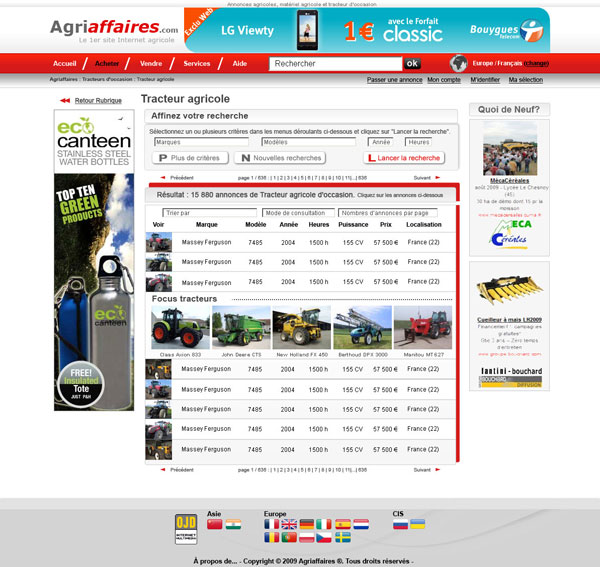
The CEO asked me to focus on few pages: the landing page, the adverts listing and the advert itself. The design of rest of the page would be more easy to design and aren’t as vital as those ones.
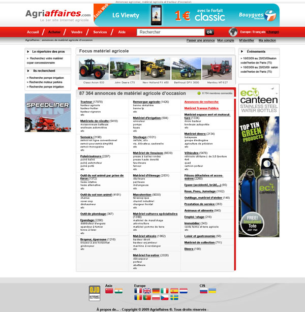
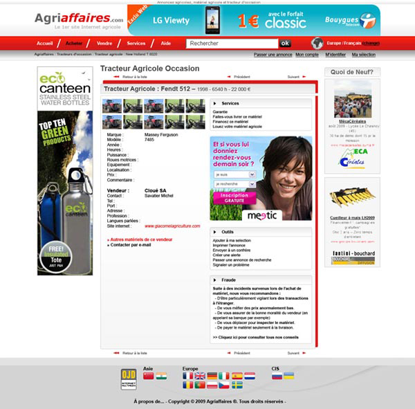
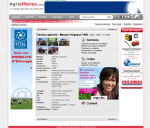
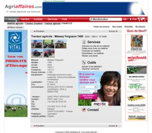
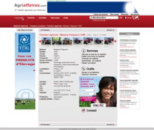
It was important to have a nice structure here and according to what needed to be shown here, I thought displaying everything on two columns made the most sense: one for the info, one for the extra services and warnings.
Also one key design element reccurent on all the pages is the path so the user understand directly where he is, so he can easily navigate on the web site, from the search results, to the ads, to another search, etc.
This project was really interesting. I’ve worked mainly using Photoshop to do this design and a lot of mock ups were done using Microsoft Word.
It was quite succesfull and the fact the design was used for about 10 years after I left the company is quite satisfying. When I left, there was about 3 millions visitors per month. Still today, the audience of the website is quite high and there is a version of the website in 20 different countries around the world, including China, US or Russia.